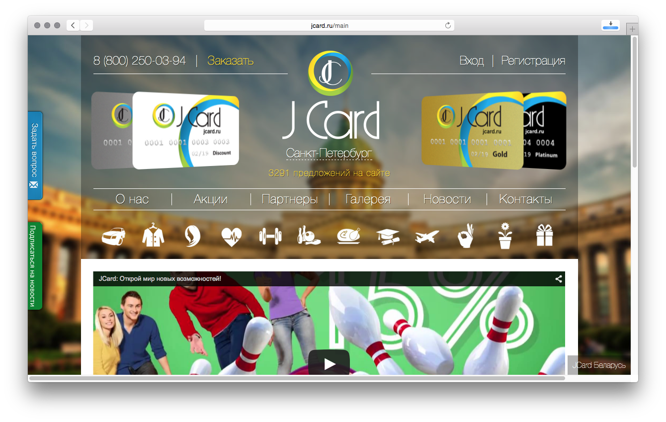
JCard is a discount aggregator working in more than 200 cities in Eastern Europe. The company issues it’s own discount cards, that provide discounts in thousands of cafes, restaurants, bars, beauty and fashion salons, stores and other companies.
Challenge
JCard was trying to quickly catch upon the mobile market and shift physical discount cards to a mobile app with unique codes, that would be integrated with POS terminals at the vendors and shops.
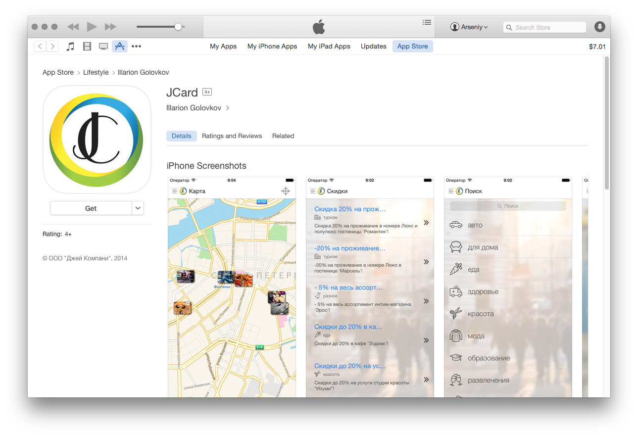
JCard App in the AppStore
Approach

For every mobile app look and feel are the things that matter most. First impression is all about the simplicity and sleekness of the design. And moreover, it is very difficult to satisfy every client’s vision and needs.
Thus a few things help:
- Always brief client very precisely on what he likes and dislikes. Start with small things and move into deeper. Spend a lot of time together on meetings and brainstorming sessions.
- Start with a prototype. Thus you’re saving a lot of effort at later design and development stages. Digital wireframing helps, as well as just drafts on napkins.
- Move into designs. Do not produce more than three versions of graphics. This will save you effort to better prepare those three, and will also save client from being overwhelmed with various designs.
- Ask to choose one version and tweak it further.
And here tools come for help. Not long ago a lot of graphic designers producing designs for mobile apps, mac apps, mac and app icons switched from Photoshop to Sketch, a tool from Bohemian Coding. There is a ton of blog posts on Sketch and how it works (1, 2, 3, 4, 5). We’ll focus on just a few workflows, that helped with the above points.
Wireframing
Due to the nature of Sketch, it is very easy to create wireframes in it – maybe even easier than in Omnigraffle or Balsamiq. Square blocks, circles, snapping to grids, and snapping to pixels – all that simplifies digital wireframing for apps.
Just remember:
Always use symbols in Sketch. It will help!
Also, apart from the design, detailed wireframes help with the functional specification and may serve as a requirements document on its own.
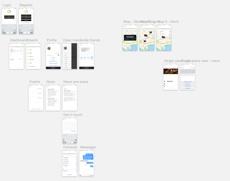
Wireframes
This especially helped us, as we were developing the app, that had to interact with the REST API, which was to be developed by the client’s technical team. So, apart from wireframes, we signed off on the stub API, which of course was further refined and modified, but served as a solid foundation for the app development.
Design
But when the wireframes are approved, it is always a special piece of work to transform those into graphic designs.
Thanks to Sketch’s symbols, it is not necessarily an issue anymore. Just pick a symbol, style it accordingly and the style will be applied to all similar elements throughout the design flow.
This helps very quickly design similar elements and thus again save time for design thought and thorough thinking.
Then same symbols let us further refine the option chosen by client.
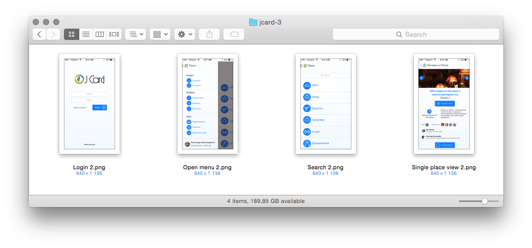
Design option 1
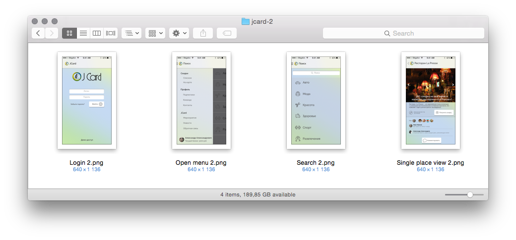
Design option 2
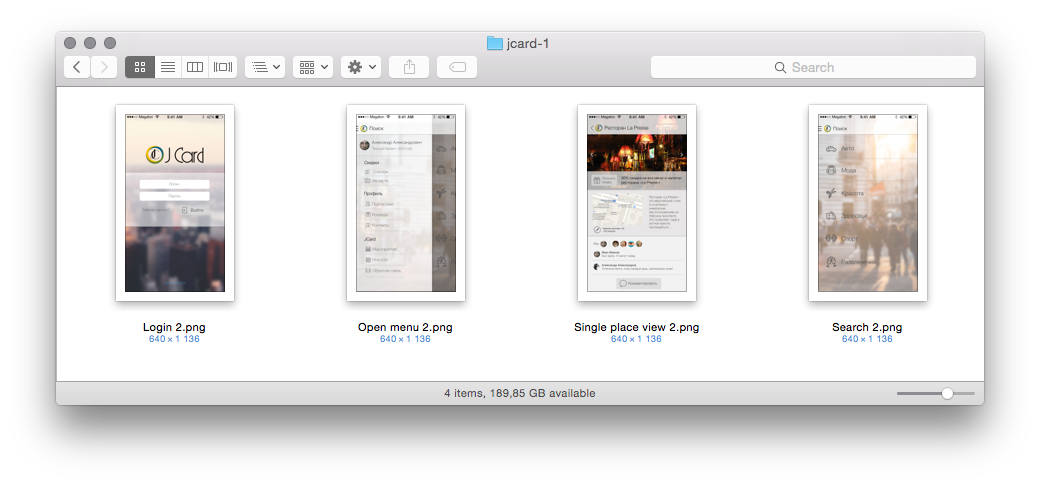
Design options 3
Development
Everyone involved in iOS development knows how painful it is to prepare assets for the development from Photoshop. With Sketch it is not the case. Choose an element, click which assets you need prepared and export.
Compared to normal slicing in Photoshop and preparing all sizes of assets, this is smooth as butter, see below:
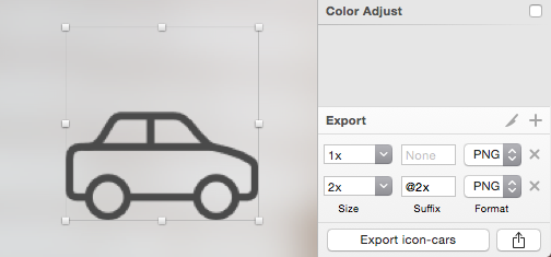
Prepare assets
In most cases, it is as smooth as it gets. The rest is pure technicalities.
So altogether, in some 3 months total we have delivered the first version of JCard app and published to AppStore under client’s account.
If you’re interested in more details, or fancy a mobile app yourself write to [email protected].